Wet Paint! Scarlet Cove
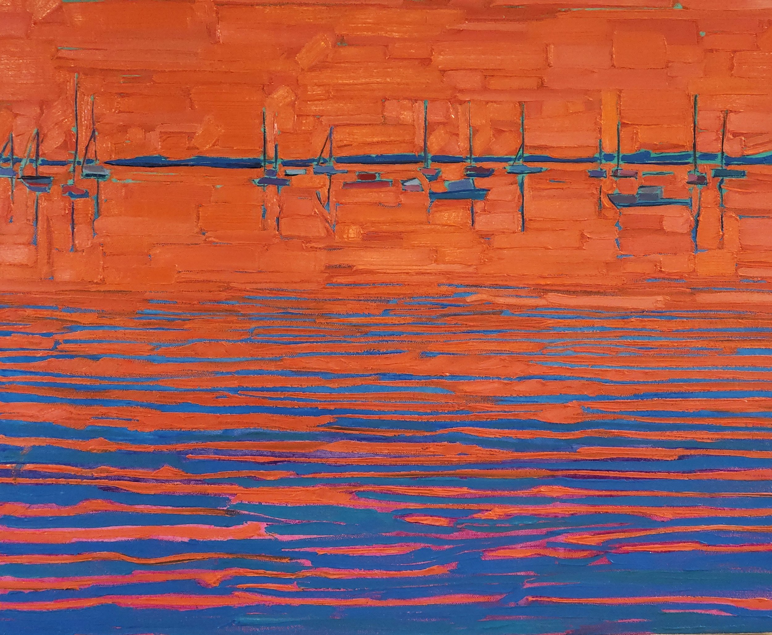
Scarlet Cove #1 24×20 2 in. depth. December 2025
Lately I’ve been exploring the philosophy of “do more with less” in my techniques. Express more gravity, more memorable scenery with less color diversity, less brush strokes, less subject matter. Impressionistic painting can be a paradox in the sense that a composition can be considered great in spite of it’s minimal “parts” and effortless appearance. The paradox is the difficulty that goes into the appearance of “effortless”. It’s quite a skill set.
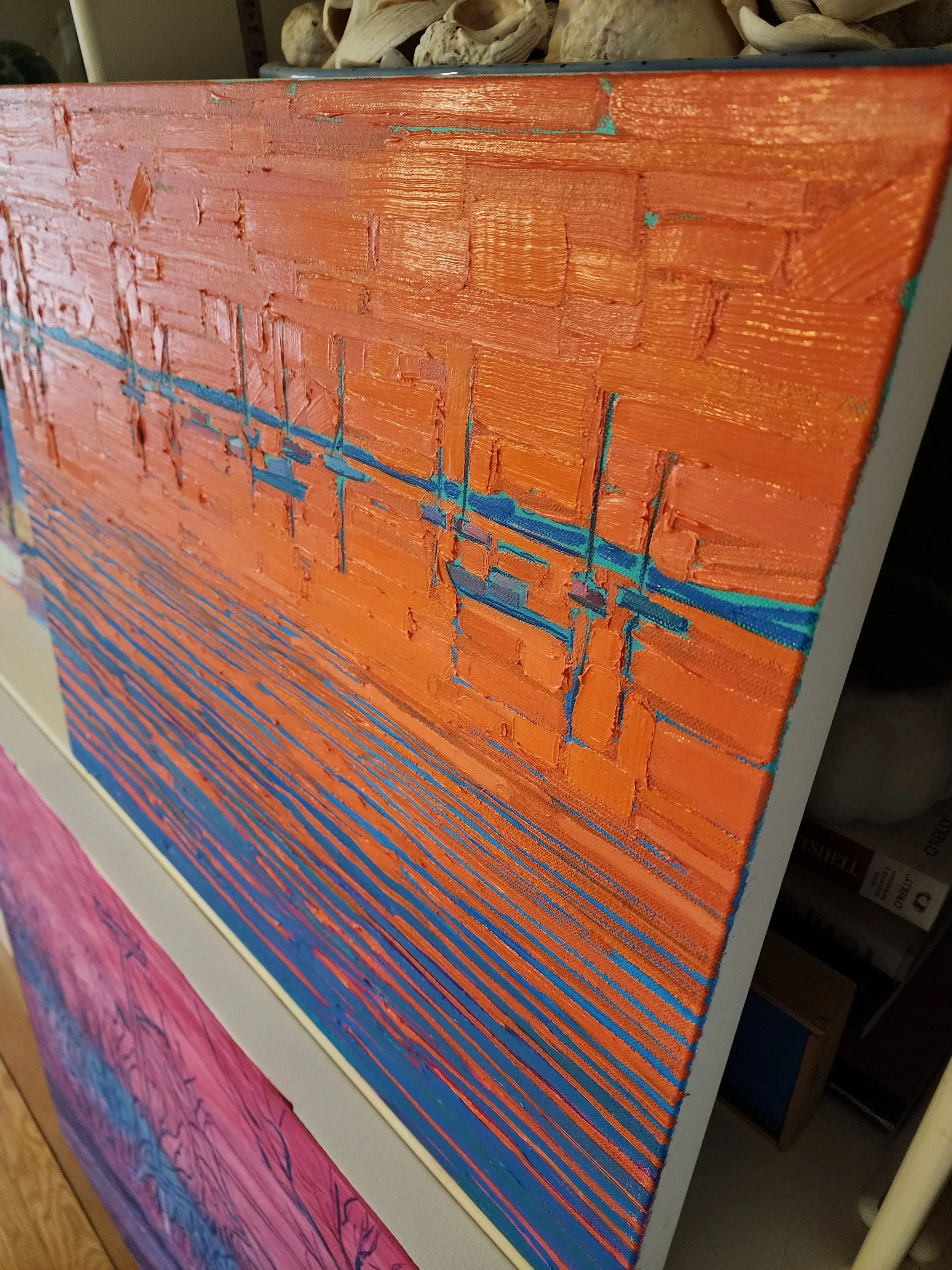
In this vein I’ve finished 1 of 2 minimalist 4-color ocean scenes I’m calling “scarlet cove”. Cadmium scarlet is a high-saturation red. The manufacturer recommends using it sparingly for places intense bright red or orange tint is needed. In these pieces the scarlet dominates the water and sky with subtle variations in brightness and chroma. The underpainting is quinacridone magenta fading upwards to tropical green as water meets the sky. Topping off the colors is a variant of phtalocyanine turquoise for water shadows and horizon.
Doing more with less in this piece means using only basic shapes to represent slips, ripples and coastline. Allowing negative space room to breathe with subtle variations in brush sizes to represent flow of water movement of air. In person it’s a clean and tranquil look.
This particular piece is 24Hx20H and 2” deep canvas. The gloss of the scarlet is medium to high. The textures are more apparent at an angle. It’s not yet framed but I plan on a simple copper floating frame 6 weeks from now when the paint cures.
I have a second version of this in the works with more boats, turbulent water, and brighter hues under development but not yet ready to publish.